
The price–capability frontier: choose a model with the chart open
Move the budget. Change the workload. Inspect the tradeoff.
A model can lead a capability ranking and still be the wrong purchase for a particular application. Another can look remarkably inexpensive until its output bill, repeated attempts, or missing task capability enters the calculation. The useful decision is rarely a single name at the top of a list. It is a set of acceptable options under explicit constraints.
This guide puts those constraints on the page. The first interactive figure uses the same kind of price and capability records behind Artificials' model charts. Change the budget to see which points remain available. Then change the balance between input and output tokens. The exercise is designed to make the decision visible, rather than hide it inside an unexplained recommendation score.
The figures use a bundled dataset, not a real-time price quote. They select the highest-index model with a matched, positive price from each maker, then retain the first ten makers by index. That selection makes the diagram readable; it is not the entire market. Use the linked model pages and full comparison chart when building an actual shortlist.
Move a constraint before picking a winner
A budget changes the shortlist
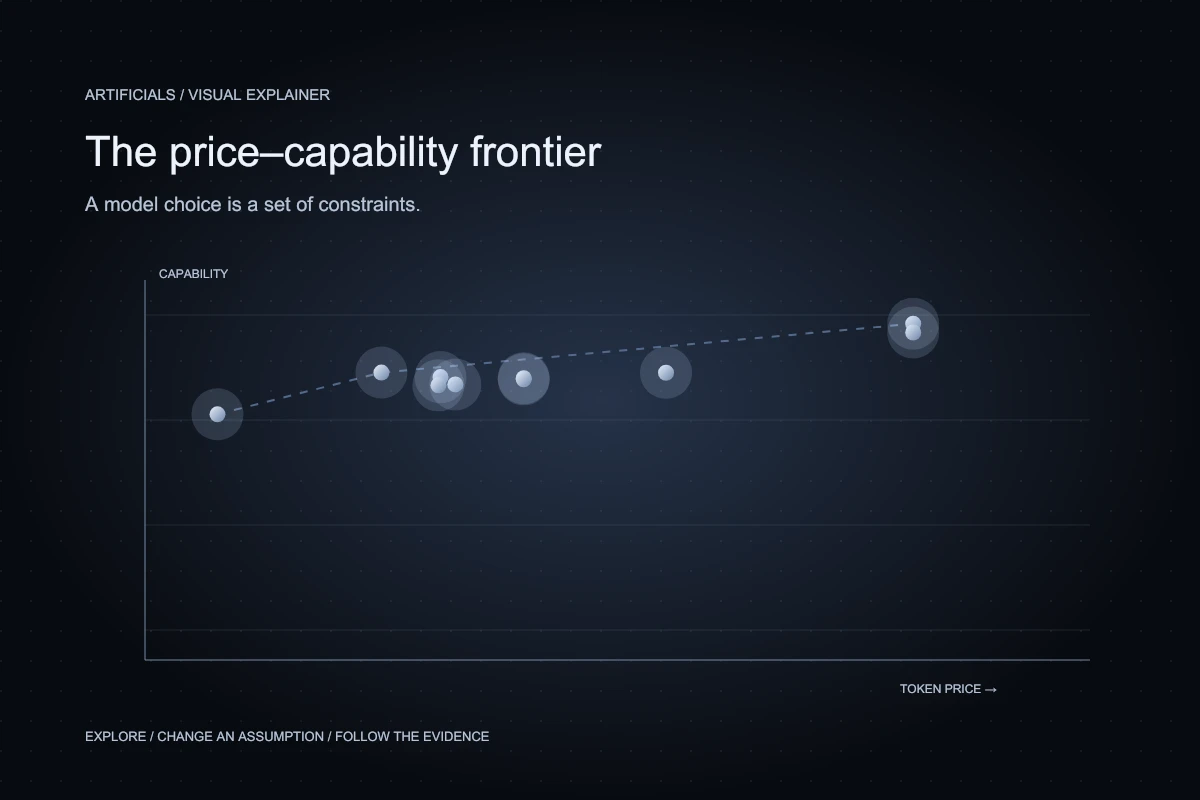
Move the ceiling, then click a maker to isolate its point. Tap a point for its values. The line connects the price–capability frontier within the visible sample.
- Frontier within this selection
Use the arrow keys to move between models. Press Enter to open the selected model. A table with the same data follows the chart.
Read the plotted values as a table
| Model | Index | USD / 1M |
|---|---|---|
| GPT-6 Astra | 166.60 | $20.00 |
| Claude Fable 5.1 | 165.00 | $20.00 |
| Gemini 3.7 Flash | 157.72 | $1.50 |
| Kimi K3 | 157.68 | $6.00 |
| Muse Spark 1.3 | 156.89 | $2.00 |
| Qwen 3.8 Max | 156.69 | $3.00 |
| Grok 4.6 | 156.48 | $3.00 |
| GLM-5.3 | 155.56 | $2.15 |
| DeepSeek V4 Pro 0813 | 155.39 | $1.98 |
| Inkling Small | 150.13 | $0.675 |
Index points are not success percentages. Prices use the maker listing or median host listing and a 3:1 input/output mix; they are not measured task costs.
Start with the price–capability plot below. Each point combines an Epoch capability-index value with a reference token price from the website catalog. Higher points have larger index values. Points farther left have lower blended prices. Moving the budget slider removes candidates that exceed that particular reference-price ceiling; it does not improve the remaining models or change their measured scores.
Notice how much information a budget boundary adds. A ranking answers which listed score is highest. A constrained comparison answers which listed options are feasible for a specified condition. Those are different questions. If no point remains, the correct result is an empty set, not an invented bargain or a recommendation that silently ignores the ceiling.
Read the axes as different kinds of evidence
The capability axis is a research index, not a percentage of tasks your product will solve. Epoch describes ECI as a scale that combines evidence across benchmarks. Its methodological role is broader comparison; it does not remove the need to inspect the underlying tasks or the uncertainty around close results.
The price axis is catalog metadata. The reference is the maker's own listed offer when available, or the middle price across eligible hosts under the site's existing matching rules. It is not a benchmark measurement of a completed workflow. Both axes are useful, but they deserve different questions: how was capability evaluated, and what billing conditions does the listing represent?
The two records can also describe different levels of specificity. An index may summarize evidence across configurations, while a catalog price describes an API offering. A scatter point is therefore a screening aid. Before relying on it, verify the exact version, reasoning setting, provider, region, and billing treatment available to your application.
A frontier is a shortlist, not a promise
Imagine tracing the candidates from the cheapest toward the most expensive. Keep a candidate only when its capability value improves on every cheaper candidate seen so far. Those retained points form a simple price–capability frontier within the displayed selection. A point below that frontier has another displayed option that is no more expensive and has at least as high an index, with a strict improvement on one dimension.
That does not make the lower point useless. It may have an important context limit, deployment option, language behavior, or interface that the two-dimensional chart omits. Dominance is always relative to the dimensions being compared. Adding a third requirement can restore a previously excluded candidate to the practical shortlist.
There is another limitation: the figure contains one selected model per maker. A smaller model from the same maker may be ideal for your task but absent from this teaching view. The frontier shown here belongs to the displayed sample, not to every model that exists. This is why the full chart remains one click away.
Change the workload and watch the price move
The same prices. A different workload.
(3 × input rate + output rate) ÷ 4 = USD per 1M total tokens
- Thinking Machines · $0.500 input / $1.20 output per 1M · Median host listing
 Inkling Small$0.675
 - Google · $0.750 input / $3.75 output per 1M · Maker listing
 Gemini 3.7 Flash$1.50
 - DeepSeek · $1.32 input / $3.96 output per 1M · Median host listing
 DeepSeek V4 Pro 0813$1.98
 - Meta AI · $1.25 input / $4.25 output per 1M · Median host listing
 Muse Spark 1.3$2.00
 - Z.ai · $1.40 input / $4.40 output per 1M · Maker listing
 GLM-5.3$2.15
 - Alibaba · $2.00 input / $6.00 output per 1M · Maker listing
 Qwen 3.8 Max$3.00
 - xAI · $2.00 input / $6.00 output per 1M · Maker listing
 Grok 4.6$3.00
 - Moonshot AI · $3.00 input / $15.00 output per 1M · Maker listing
 Kimi K3$6.00
 - OpenAI · $10.00 input / $50.00 output per 1M · Maker listing
 GPT-6 Astra$20.00
 - Anthropic · $10.00 input / $50.00 output per 1M · Maker listing
 Claude Fable 5.1$20.00
Calculated comparison, not a measured bill. Excludes cache discounts, tool fees, batch discounts, retries, and infrastructure.
The familiar blended price assumes three input tokens for every output token. The workload control lets you replace that assumption. For a ratio of r input tokens per output token, the price per million total tokens is the sum of r times the input price and one output price, divided by r plus one. Both the unit and denominator matter.
Suppose an invented service charges two dollars per million input tokens and eight dollars per million output tokens. A three-to-one mix costs three dollars and fifty cents per million total tokens. An equal mix costs five dollars. Nothing about the tariff changed; the workload changed. These numbers illustrate the arithmetic and are not an additional model listing.
The second figure applies the same calculation to the actual reference prices in the selected dataset. It also shows the input and output rates separately. A single blended number can conceal why two candidates respond differently to an output-heavy task. Read the component prices before concluding that the ordering is stable.
Estimate a completed job, not an isolated call
A reference price is most useful after the application has a task definition. Consider a hypothetical support workflow that reads a ticket, retrieves approved guidance, drafts an answer, and asks a reviewer to check uncertain cases. The application may make more than one call. Some calls include repeated context, and some produce output that never reaches the customer.
Write down all model calls needed for one completed case, including validation and recovery. Record the total billed tokens and the fraction of cases that satisfy the acceptance criteria. A cheap first answer that routinely needs correction can have a higher cost per accepted case than a more expensive first answer that usually completes the job.
Keep human review and infrastructure separate rather than pretending the token calculation includes them. Database operations, retrieval, logging, queue time, and review effort belong in the operating picture. They may not be charged by the model provider, but they still influence whether the application can serve its intended users reliably.
Cached tokens need their own accounting
Caching can alter an actual bill, but a discounted rate should not be applied to all input by default. A cache hit depends on the provider's rules and the request pattern. Shared instructions may repeat while user-specific evidence changes. An application that rewrites its prefix on every call may achieve a different cache pattern from one that keeps a stable reusable prefix.
The figures deliberately use ordinary input and output reference rates. They exclude cached-input discounts, tool charges, batch discounts, and provider-specific billing details. That keeps the exercise interpretable. When estimating production cost, use observed eligible cache hits and the actual contract rather than reducing every token by a hopeful discount.
Check what happens when the cache is cold. A short load test after repeated identical prompts can make both cost and response time look better than a day of varied traffic. Report cold and warm conditions separately so the operating plan survives a deploy, a restart, or a sudden change in user questions.
Treat quality requirements as gates
Budget filtering should sit alongside task-specific quality gates. Define unacceptable behavior before examining the models. For a source-grounded assistant, that might include fabricated policy clauses, missing exceptions, or disclosure of a record the reader cannot access. A general capability score does not directly measure those application failures.
Evaluate feasible candidates on the same reviewed examples and the same output contract. Include ambiguous requests and cases where abstention is the correct response. Keep the evidence for each failure. If every affordable model fails a necessary requirement, narrowing the product task or adding a deterministic check can be more sensible than choosing the least bad score.
Avoid turning the broad index into a fake probability of success. Dividing a price by an index value produces a ratio, but it does not automatically produce a meaningful business measure. A cost per accepted task, measured under a clear acceptance rule, is easier to interpret than an attractive but arbitrary price-per-intelligence number.
Run a small, reproducible buying experiment
Choose a handful of feasible candidates and preserve the exact settings for each run. Use examples held apart from prompt development. Measure accepted-task rate, token consumption, response-time distribution, and review burden. Keep the comparison paired so each model sees the same cases, and repeat enough runs to expose meaningful variation.
Then test a plausible workload change: longer source documents, shorter answers, more difficult questions, or a temporary traffic spike. The second figure suggests one sensitivity analysis, but actual workflows have more moving parts. The purpose is to discover whether the choice remains sensible when the easy assumptions stop holding.
The final decision should name a model, a configuration, a budget, and a fallback plan. Preserve the reasons for the choice so a later price change or model update can trigger a focused reevaluation. A chart is most valuable when it leads to an inspectable decision rather than a screenshot that cannot explain itself.
Keep the chart beside the question
Return to the first figure after defining the task. Your interpretation should now be more precise. The budget boundary describes one constraint. The index supplies one broad signal. The frontier reduces the number of candidates worth investigating. None of those elements substitutes for the evidence your particular product needs.
Use the controls to form a hypothesis, then test it with representative work. That is the productive role of a model comparison chart: it makes tradeoffs visible, exposes hidden assumptions, and helps you ask a smaller, better question before spending money or committing an application to a provider.